Piotr Rypson was born in 1956. He started out in Mediterranean archeology, later specialising in the Renaissance and Baroque concepts of “labyrinth letters” and branching out into everything created at the intersection of signs, letters, words, and images, i.e. the conceptual (the evolution of visual poetry, mail art, and the work of Krzysztof Wodiczko) and the entirely functional — graphic design and visual communication.
Rypson’s unquestionable authority is the result of his years of work in many prestigious positions, including main curator of the gallery and collections of the Warsaw Centre for Contemporary Art, and lecturer at the Rhode Island School of Design in Providence. I, of course, remember nothing of that, as I was too busy playing with my Barbie dolls and Legos at the time. It wasn’t until recently that I “discovered” Rypson in a copy of the irregularly published magazine Piktogram. I was immediately struck by his trademark style: a staggering quantity of visual material annotated with essential and substantive commentary. The two are inseparable, like in contemporary emblems.
The same is true of Rypson’s Nie Gęsi. Polskie projektowanie graficzne 1919–1949. (Polish Graphic Design, 1919–1949). The author spent a good few years working on the hefty tome. The material within has never been published before. The book is all the more impressive when we realise what obstacles the author had to overcome to obtain and compile the content. Aside from private collectors and a handful of libraries, there are practically no institutions in Poland dedicated to collecting, storing, and displaying the work of Polish graphic designers. Unless we consider that institution to be Piotr Rypson himself (and his predecessor Szymon Bojko).
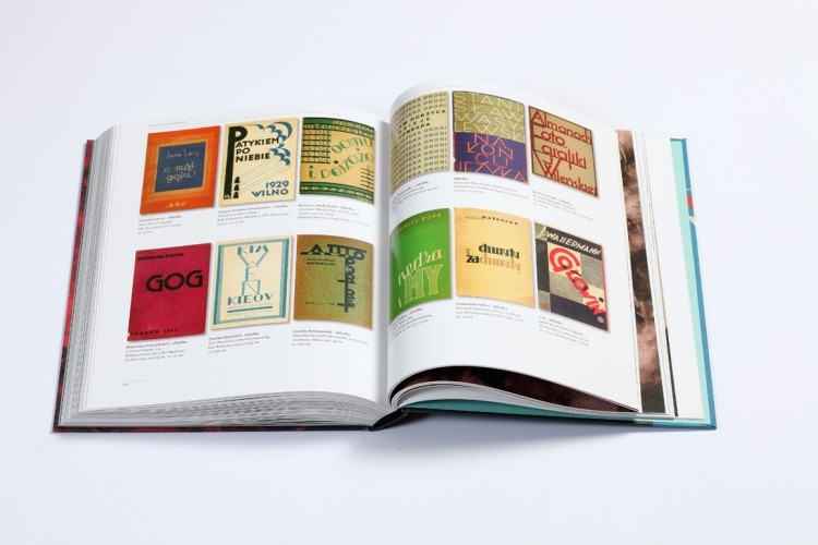
 Rypson uses several parallel structures to describe the birth and evolution of graphic design in independent Poland, World War II, and the brief period immediately afterward. It’s up to the reader to choose which narrative path to follow. There’s the great political story that begins with Poland’s declaration of independence in 1918, interrupted by the outbreak of World War II, and ending with the imposition of Socialist Realism. Then there’s the story of art/design/literature/Polish publishing — everything associated in any way with print, content, and form. But most importantly, there is the story of everyday life, one that is extraordinarily vivid and surprisingly diverse. The author’s aim was to depict the many dimensions of life at the time through the lens of two-dimensional design. He has compiled examples of absolutely everything, from the Polish coat of arms and the Home Army’s “anchor” symbol, to Polish pulp fiction rags, advertisements (likely the most interesting field for anyone researching what our grandparents wanted or were expected to want), and even fliers and the bank slips that have survived unchanged, surprisingly enough, to this day.
Art historians will find famous currents in high art, such as the avant-garde and so called “nation building” art, reflected in the design of the time. Add to that over three hundred artists, from the famous to the long-forgotten and the never-discovered. Rypson has no ambition of distilling the list down to the best of the best, and rightly so. Like a true archaeologist, he uncovers every layer without exception, leaving the verification and appraisal of the “artifacts” to the reader. His contribution to future generations is the rich documentation collected by himself and his friends. His work reassures armchair collectors that the value of their carefully stored candy wrappers and perfume bottles is more than just sentimental.
Nie Gęsi is also required reading for practitioners of design, who will find in it an abundance of formal inspiration, along with answers to the question “Where do we come from?” and perhaps even “Where are we going?” Where does the path that starts after World War I lead? What are the political, ethical, and economic factors that influence the work of the designer?
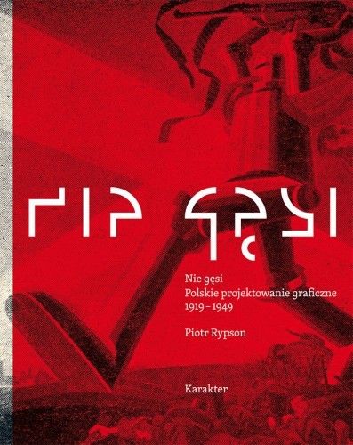
There exists a clear parallel between the situation in the young, independent inter-war Poland and the condition of contemporary Polish graphic design, which still has quite a bit of catching up to do. It is in this context that the visual aspect of Nie Gęsi is a disappointment. Karakter publishing house co-founder Przemek Dębowski, the cover and layout designer and typographer in one, certainly put great effort into organising this diverse body of material. But there is a sense of chaos about the book, and it starts with the cover. For some reason, Dębowski chose to use part of a 1936 illustration titled Wojna, głód, pomór (War, Hunger, Plague) as the background for the title, which in turn is printed in Artur Frankowski’s obscure and illegible font Komunikat (2004), a redesign of Władysław Strzemiński’s original 1931 version. The inscription is then repeated in the publisher’s favorite typeface, Skolar, in case readers have trouble deciphering the title.
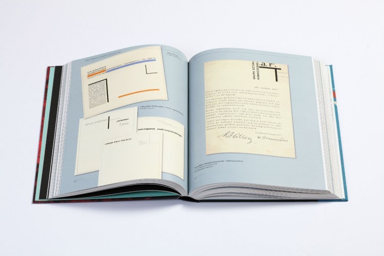
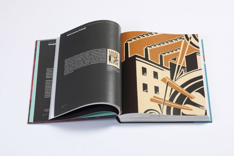
It doesn’t get better inside. Reprints of yellowed paper abound: some in reduced size, others scaled up; some are wedged onto the page at an angle, others overlap. The ubiquitous drop-shadows are at once irritating and dated; a redundant attempt at making the already diverse content appear more dynamic. Recommended in small servings.
translated by Arthur Barys


